|
|
|
|
|
| Author |
|
|
G'day!
|
Font for my business sign
I'm in the process of having some new signs made for my landscaping business and want the lettering to be retro-style....like mid-century modern meets Tiki meets Las Vegas.
So far I kinda like this one...Cocktail Shaker: 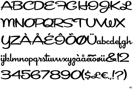 Here's another called Festiva: 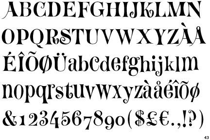 And I like this one (the House Industries part) but don't know what it is named...any idea?  There's a lot of whimsical and crazy fonts but I want it to be legible from a distance yet unique to my personality  What do you all think?
__________________
Old dog....new tricks..... |
||
 02-13-2012, 06:37 PM
|
|
|
Cogito Ergo Sum
|
First two are easier to read. What type of signs are they? Size?
|
||
|
02-13-2012, 06:40 PM
|
|
|
G'day!
|
Quote:
I'm also going to have a sandpiper icon at the far right side from top to bottom by itself. Going to made from aluminum and on a large diameter bamboo stake. They will be left on the site after each project with the owner's consent. Most of my customers want me to put a sign up. But I don't want to come across like a "car salesman". I want my signs to be tasteful 
__________________
Old dog....new tricks..... |
||
|
02-13-2012, 06:45 PM
|
|
|
Registered
Join Date: Dec 2005
Posts: 3,384
|
The "army" or "home depot" style stencil letters sound like exactly what you're searching for.
|
||
|
02-13-2012, 06:46 PM
|
|
|
The Unsettler

Join Date: Dec 2002
Location: Lantanna TX
Posts: 23,885

|
There are two facts about fonts.
Generic fonts are boring but easy to read. Fancy fonts are exciting but hard to read. If we are talking side of moving truck signage I'd go for easy to read. EDIT: Based on the description of your signs I'll go with Cocktail Shaker as choice 2 and House Industries as 1st. Hint on what it's called, http://www.houseind.com/.
__________________
"I want my two dollars" "Goodbye and thanks for the fish" "Proud Member and Supporter of the YWL" "Brandon Won" Last edited by stomachmonkey; 02-13-2012 at 07:00 PM.. |
||
|
02-13-2012, 06:47 PM
|
|
|
G'day!
|
Quote:
")
__________________
Old dog....new tricks..... |
||
|
02-13-2012, 06:49 PM
|
|

|
|
<insert witty title here>

|
I've always enjoyed the more fancy type fonts when designing something, but inevitably when it's handed over to a pro and they rework it with simpler fonts, it looks better and more professional. So I'd say it's a toss up between displaying your personality and looking professional. And yes, those are often in conflict. At least in my case
Here's a thought, post your draft of the sign, even if it's just a drawing on an envelope, and we'll have a go at different fonts. That way you'll get a lot of different perspectives.
__________________
Current: 1987 911 cabrio Past: 1972 911t 3.0, 1986 911, 1983 944, 1999 Boxster |
||
|
02-13-2012, 06:50 PM
|
|
|
G'day!
|
Quite a few of my projects are signature properties where people visit on bicycles or walking or in neighborhoods with a 15 MPH speed limit so I don't need a billboard - just something that tells who did the work when people stop and gawk at the masterpieces..

__________________
Old dog....new tricks..... |
||
|
02-13-2012, 06:52 PM
|
|
|
G'day!
|
Quote:
I'll be at my sign maker tomorrow and hopefully she will have a draft for me this week sometime...thanks for the comments and info! 
__________________
Old dog....new tricks..... |
||
|
02-13-2012, 06:56 PM
|
|
|
<insert witty title here>
|
It's not a question of being easy to read, it's a question of looking clean, sharp and professional.
__________________
Current: 1987 911 cabrio Past: 1972 911t 3.0, 1986 911, 1983 944, 1999 Boxster |
||
|
02-13-2012, 07:06 PM
|
|
|
Registered
Join Date: Jun 2000
Location: bottom left corner of the world
Posts: 22,870
|
Quote:
Photograph signs of the style you like then see a sign maker/graphics place. It's important you get this sorted now, and looking good, because the look will be your logo and will draw clients or scare them away if you get it wrong. |
||
|
02-13-2012, 07:09 PM
|
|
|
G'day!
|
Quote:
__________________
Old dog....new tricks..... |
||
|
02-13-2012, 07:09 PM
|
|
|
Registered

|
Here's a few retro options.. and free too!
Free retro,1950s fonts - FontSpace Be sure the check out all 5 pages.. there's some good clear ones that would work well for signage.
__________________
1984 911 Cabriolet - Destroyed :-( - Looking for the next one.. 1997 M3 sedan - Daily Driver 1988 Ferrari 328 GTS - Needs to be driven more |
||
|
02-13-2012, 07:26 PM
|
|
|
Registered
Join Date: Dec 2001
Location: Cambridge, MA
Posts: 44,716
|
A few that you may like, some you won't but they are all distinctive.
Aspire BirminghamTitling Brush Script Buffalo Nickel Dragonwick Herald Square Ironick New Day Sidhe
__________________
Tru6 Restoration & Design |
||
|
02-13-2012, 07:27 PM
|
|
|
G'day!
|
David and Shaun - thanks - going to look hard at these...great input!

__________________
Old dog....new tricks..... |
||
|
02-13-2012, 07:42 PM
|
|
|
Cogito Ergo Sum
|
A few things to consider when designing a sign.... How close will the viewer be, and what is the window of opportunity or how long will they be able to read it?
The farther away they are, and the shorter the time they can see it, the less complex you want to be. For what I think you are describing any of the above would work. For a fairly small sign that the viewer can spend some time reading, the last font is great. It reads fairly well but has character. Now if you are expecting them to read it whilst driving by, then get a little simpler. And remember, don't put a book on there, just the basics..... Oh, and I grew up in and work in the Sign industry...
|
||
|
02-13-2012, 09:36 PM
|
|
|
Registered

Join Date: Mar 2001
Location: Marysville Wa.
Posts: 22,548
|
i use "tall deco" on my cards. stylish and easy to read.
__________________
https://www.instagram.com/johnwalker8704 8009 103rd pl ne Marysville Wa 98270 206 637 4071 |
||
|
02-14-2012, 05:14 AM
|
|
|
Banned
Join Date: Jan 2007
Posts: 8,509
|
Don't go with those fonts if you want a professional image. If it's a landscaping business I would go with a clean simple sans serif- Helvetica, Futura or Arial for example. If you want to use a classic font use a real classic, Bodoni, Times New Roman etc. Even then I'd use that for the title of the business and use a sans serif for ancillary information.
|
||
|
02-14-2012, 05:23 AM
|
|
|
Registered
|
Both Cocktail Shaker and Festiva are cartoonish and unprofessional looking. Legibility IS important for a name as long as yours. People need to be able to read your name while driving by the house, or while you're driving by with it on the side of your truck. The House Industries font works because the words are relatively long and the first letters are huge. It is recognizable even when it isn't completely legible. With the long name of your company I would go with that concept whatever font you use.
Sandpiper Concepts
__________________
. |
||
|
02-14-2012, 06:02 AM
|
|
|
Registered
Join Date: Sep 2003
Location: Vermont
Posts: 1,199
|
What do you currently use on your business cards, trucks and letterhead? You want consistency across all your advertising, especially since your signage (truck or on site signs) are seen when the customer is moving, the truck is moving or both.
If you don't have one already, it is worth having a conversation with a graphic designer that can develop a graphics package that works for all your advertising needs. Sandpiper Concepts doesn't immediately convey landscaping so you'll have to spell that out main services in simple easy to read text on the signs. |
||
|
02-14-2012, 06:47 AM
|
|


 1964 Porsche 356 C Sunroof coupe
 1972 Porsche 914 2.0 fuel injected
 1983 Porsche 911 SC Targa
 Work vehicle

 1986 Porsche 944 2.5l
 1972 Porsche 911T 2.4
 P-Car
P-Car
